01 / Brand & Web
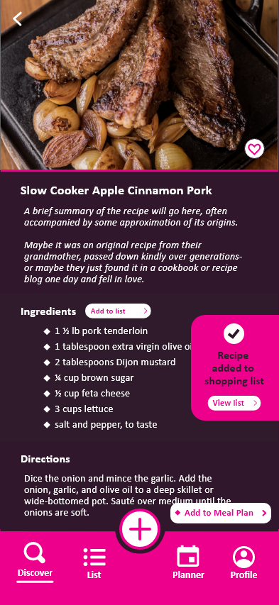
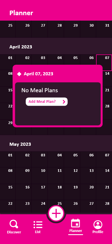
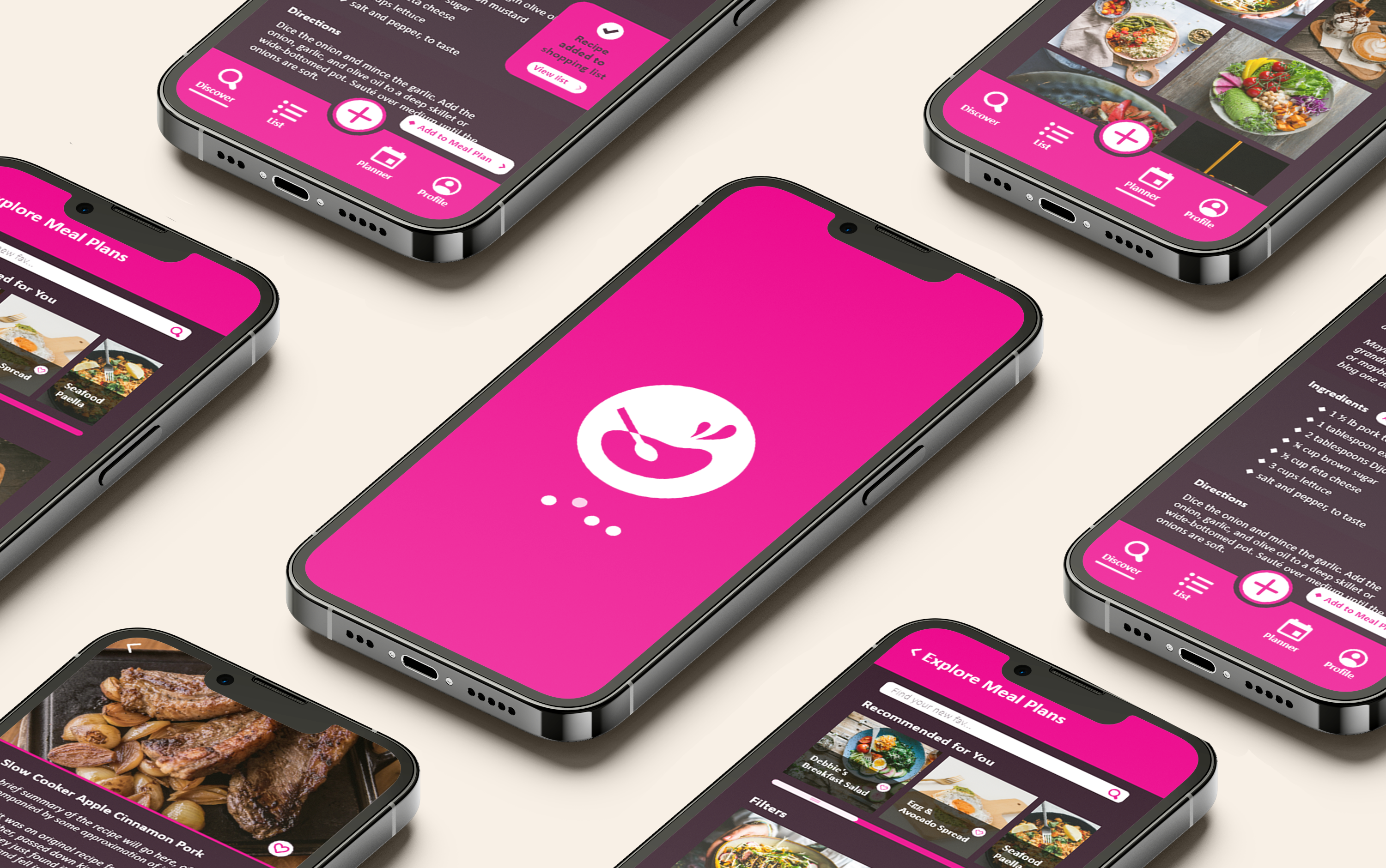
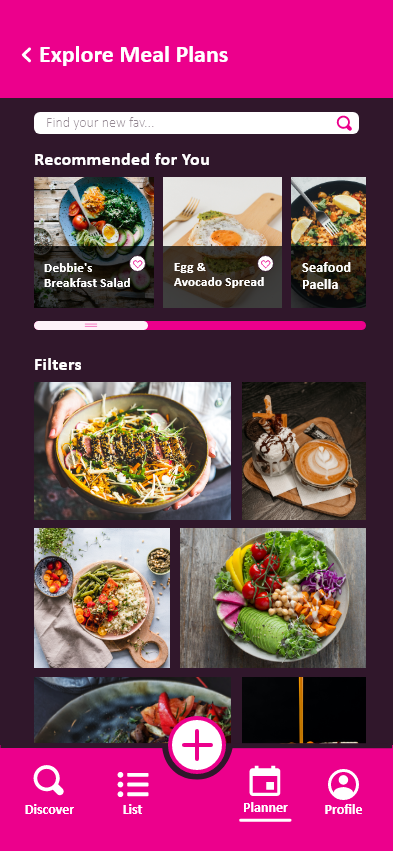
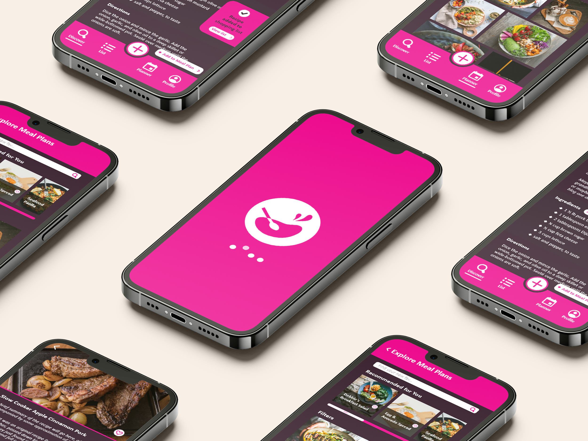
Recipe App
A contemporary fashion label needed a visual identity that could hold its own against legacy houses while feeling genuinely new. The brief was deceptively simple: make something quiet that commands a room.
We built the brand around restraint — negative space as a design material, typography as texture, photography as the primary voice.
The resulting system works across seasonal campaigns, packaging, and an immersive web experience that prioritises editorial pacing over conversion metrics.
Research began with the label's archive — a decade of show programmes, lookbooks, and runway footage. The language of the brand was already there; it just needed to be made coherent.
Three directions were developed in parallel. All three were typographic-first. The chosen direction used a single serif cut across two weights, set with extreme tracking in headlines and near-zero tracking in body copy — a tension that mirrors the collection's relationship between structure and ease.
The web experience was built as a sequence of scenes rather than pages. Each scroll step is deliberate, each transition rehearsed.
Typography was treated as a material in its own right — weight, spacing, and scale used to communicate hierarchy without relying on colour alone. Every decision traces back to a single question: does this serve the content, or is it serving itself?

The identity launched with the SS25 collection. Press coverage included features in Vogue Business and Wallpaper*. Online sessions increased 3× in the first month.
More importantly: the brand finally looked like what it had always felt like.